Get Good
Overview
Get Good is a series of videos that educates users on a certain fitness skill.
Product goal:
To deliver the classes in an interesting and engaging way, in a series of videos. The video series is designed to compliment the Baseblock (an exercise product funded on Kickstarter after 4 hours).
Business goal:
The purpose is to diversify the business to increase longevity of the brand and lifetime value of the customer, and ultimately revenue.
Project challenge:
To create a paid online video series that offered value to existing and new customers, whether they owned the Baseblock or not.
Team & roles:
Client & Product Owner - Jason Gulati
UX/UI designer - Tina Lee
Web Developer - Rick gibson
Content Producer - Benjamin Joseph
Deliverables:
Research and validation of product idea
Landing page design for product launch

Landing page final prototype
Using the Google Design Sprint Method
I decided to use the Google Design Sprint method to come up with a testable prototype and solution that wasn’t based on assumptions. This will allow us to accelerate the product for launch and learn what’s working and what’s not quickly.
Session 1: Mapping out the problem

Mapping out the problem: goals, sprint questions, customer journey flow
What was the Long Term 6 month goal?
Get 5000 users to purchase the Handstand video series
what’s the challenge we are focusing on?
“How do we get users to pay to watch the handstand series?”
Reframing the problem into opportunities:
“How might we make users feel confident to purchase handstand videos?”
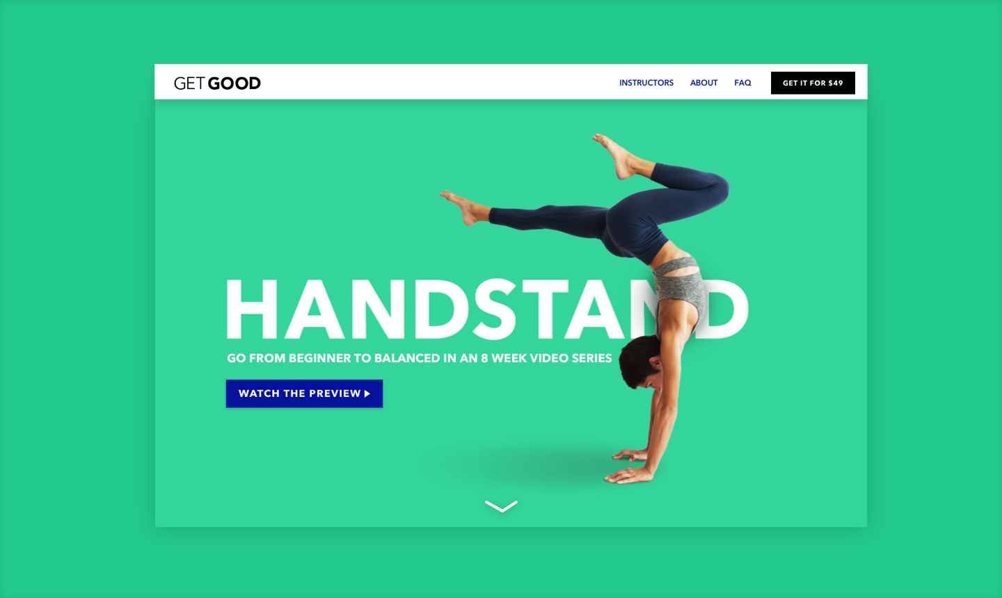
Project goal:
Create an effective landing page that communicates the value of the product to attract user purchase.
Session 2: Sketching
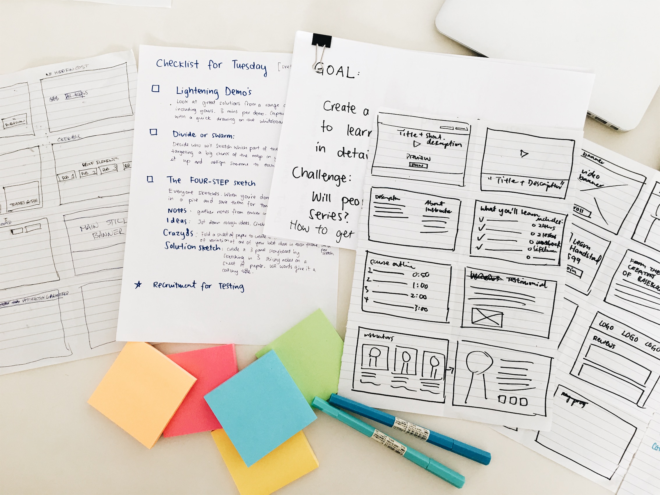
Above: tools for day two, Crazy 8’s sketches
Research
Before we began Day 2, we set ourselves a research task as we realised after Day 1 that we needed some questions answered by users.
Goal:
To get an insight into the behaviour and thinking of users that will influence the landing page solution.
Help us prioritise features and content on the landing page.
We interviewed:
Existing users of online education platforms - what their current experience is, their pain points, why they signed up, what’s important to them before they purchase classes.
Non existing users of online platforms but customers who are interested in learning a skill - what do they currently do to learn skills, before they purchase an online course, what would they consider?
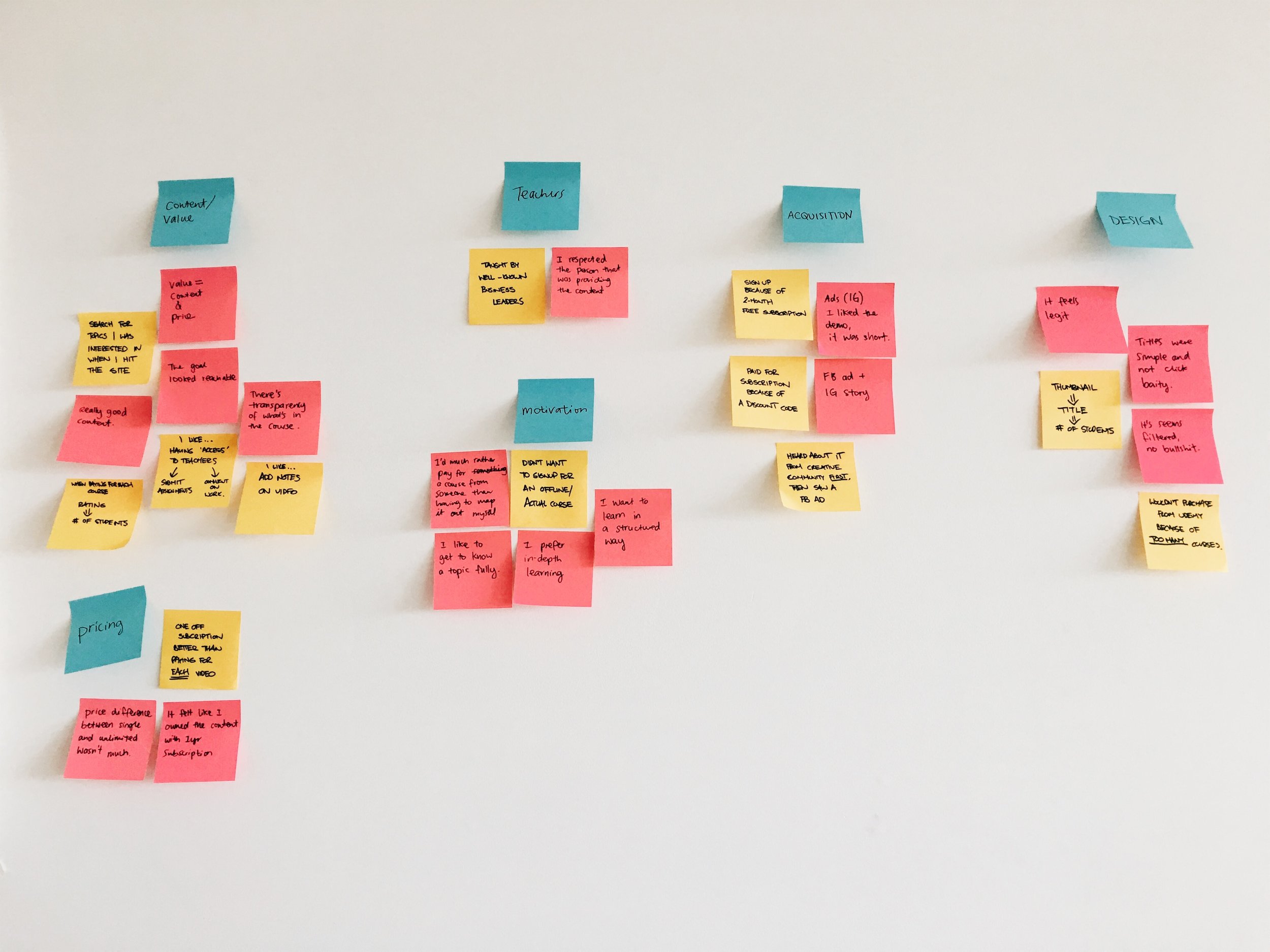
Affinity Mapping
We used an affinity map to recognise any patterns from the user interviews. After categorising the findings, we mapped this onto a customer journey map.
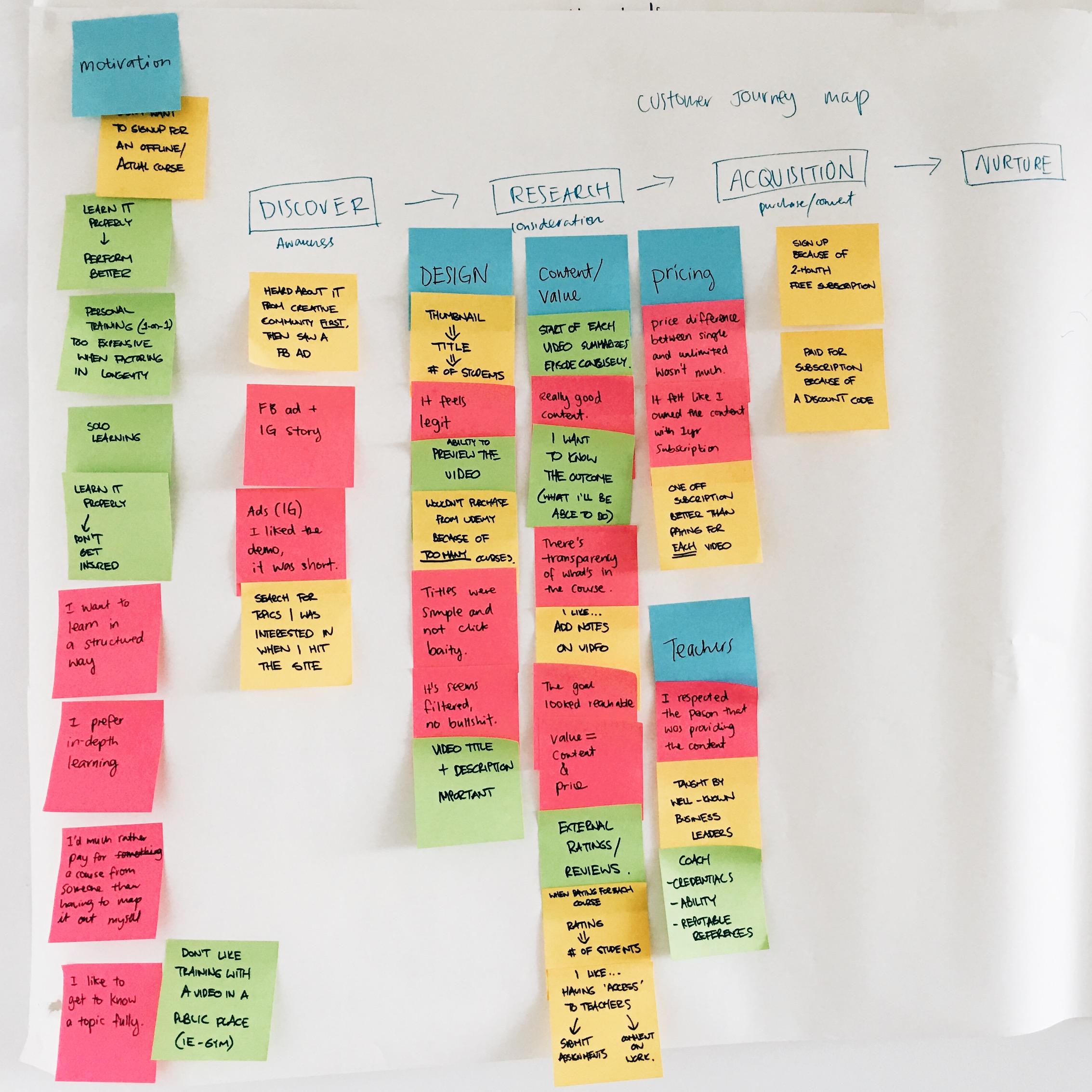
Lightning Demo’s
Competitor research & Analysis: Masterclass, Curiosity Stream, Skillshare & Udemy.

Above: Sketches from lightening demo’s. This was helpful when we had to sketch ideas of solutions as we could use this as reference.
Crazy 8’s
We sketched solutions for the home page and the class page. We decided that since the product was launching with only one lesson, we’d create a single landing page instead of both a homepage and a class page.
The research allowed us to prioritise the page elements and features that motivate user purchase and subsequently meet the business goal.
Session 3: Prototyping
Lo-Fi Prototype
Instructor profile: From our findings, we concluded that the instructor of the class was one of the most important factors influencing a user’s decision.
Reputation: It was important for the instructor to be credible and have reputation. This is why we decided to showcase the instructor background early on in the landing page.
Class structure: Users wanted to know the duration and number of classes in a clear manner as well as the price in order to evaluate the value of the class immediately.
Price transparency: We decided that the hero banner, above the fold would include a direct message including price and a CTA button for transparency.

Paper prototype of landing page

Above: Landing page wireframe. Left: Option 1, Right: Option 2.
Initial testing findings:
CTA Button: ‘Start the Class’ button was removed from the hero banner because users didn’t have enough information to click.
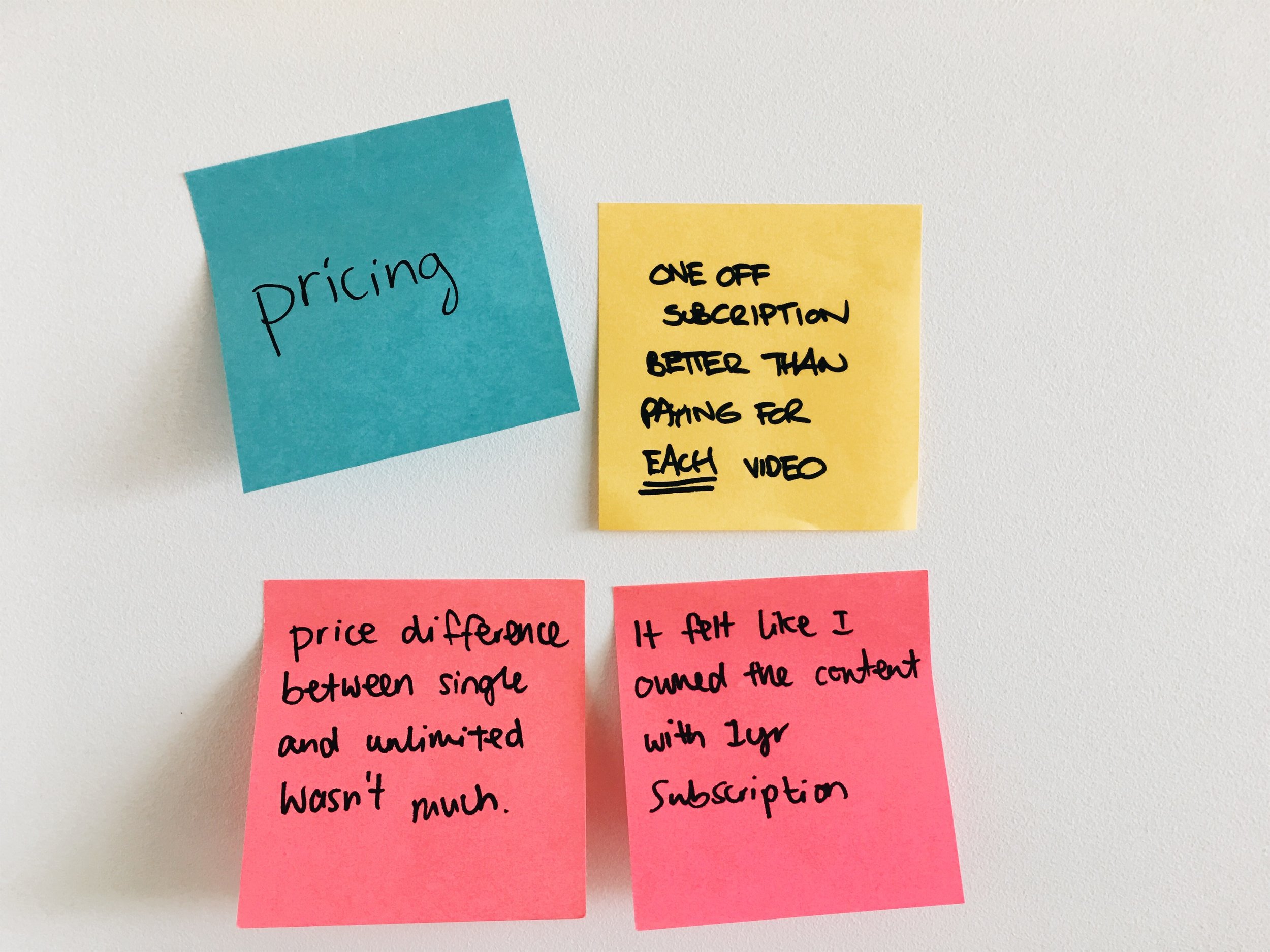
Pricing: It was unclear to users what the product actually is and what they were getting for the price.
eBook: The eBook sign up was unclear to users, what does the eBook include?
Lesson details: Users wanted more information about the lesson descriptions.
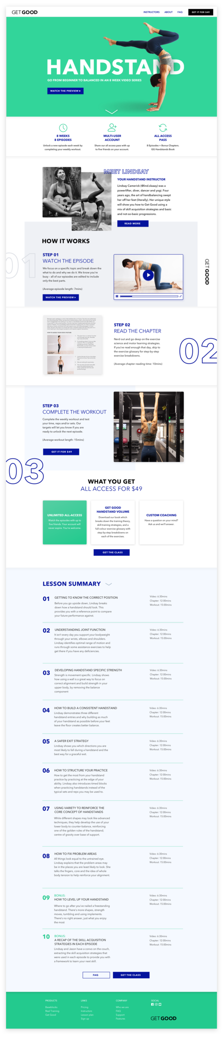
Session 4: High-fidelity Prototype
Final Testing
To be Continued…
This is a live project that I’m working on and I will be updating this as I progress. Check back soon for usability testing results.